This project is a hypothetical rebranding of Moxi Skates. Moxi is a California-based company that sells roller skates. I was inspired to choose this brand for my project because I love roller skating and I own a pair of Moxi skates.
I started off collecting survey responses about peoples' current feelings towards the brand. I received 62 responses, and about half of the respondents own roller skates. The key takeaways from my survey were that: (1) the current logo is hard to read, (2) 70% of the people who responded to the survey believe the logo should be changed, (3) a lot of people haven’t heard of Moxi (even people who own skates), and (4) a lot of people associate their logo with energetic and friendly qualities, but also with unprofessional and low-quality.
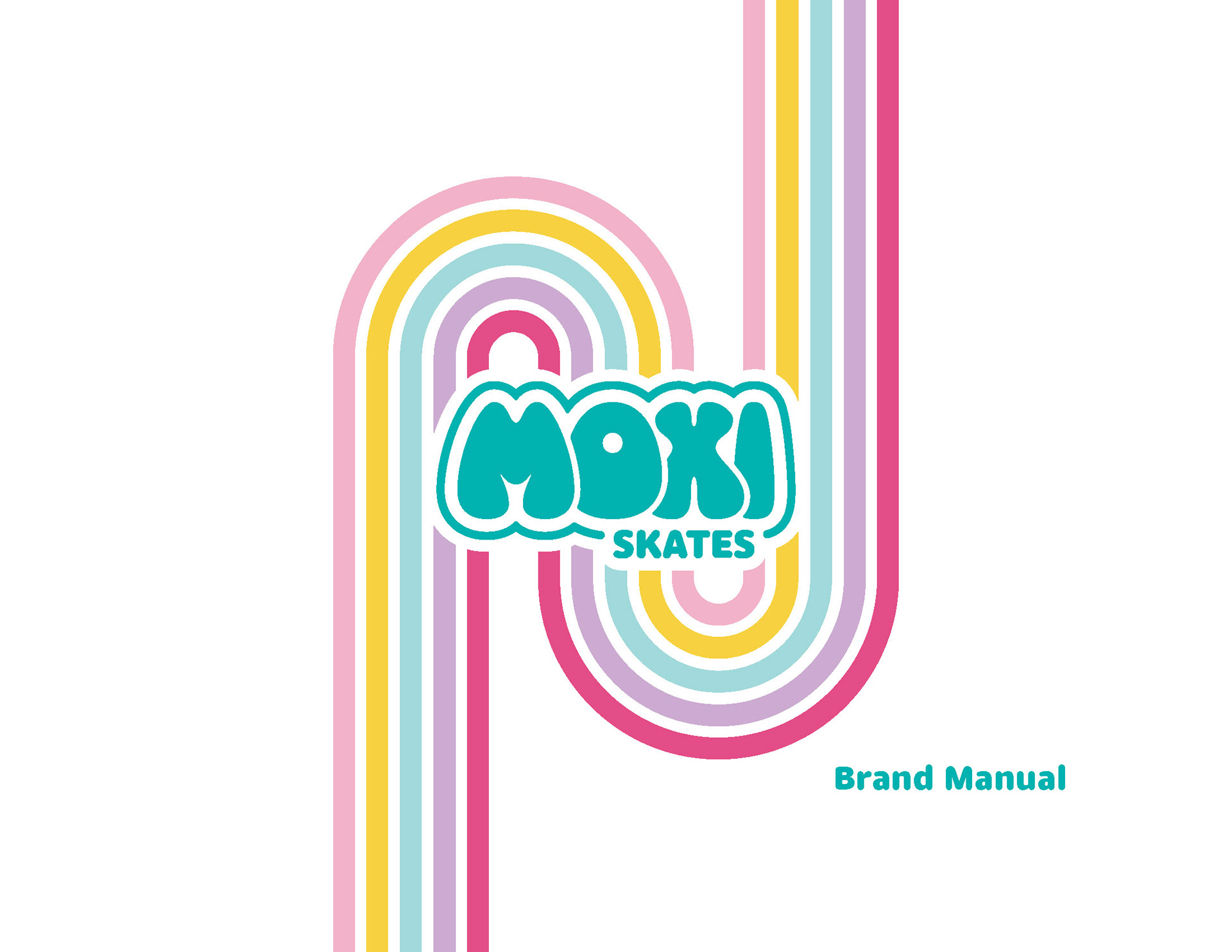
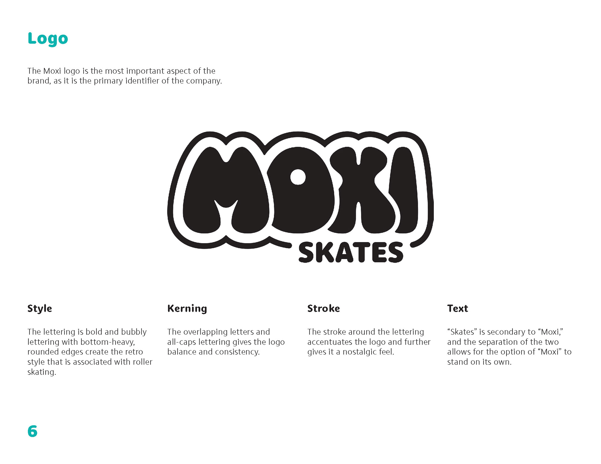
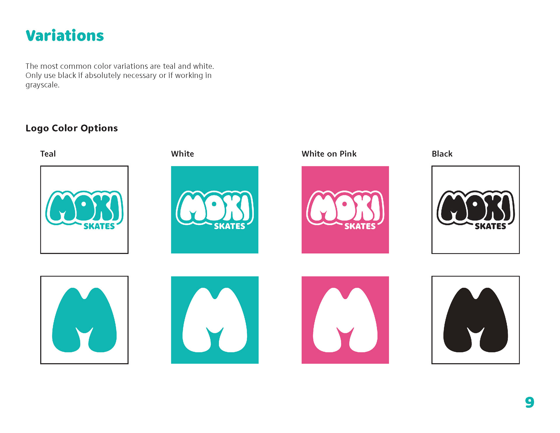
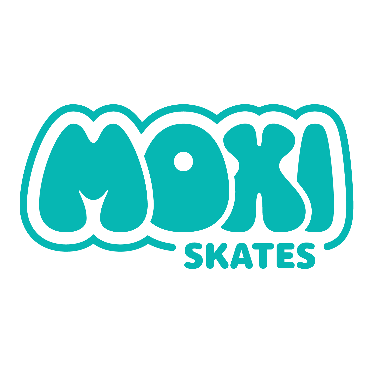
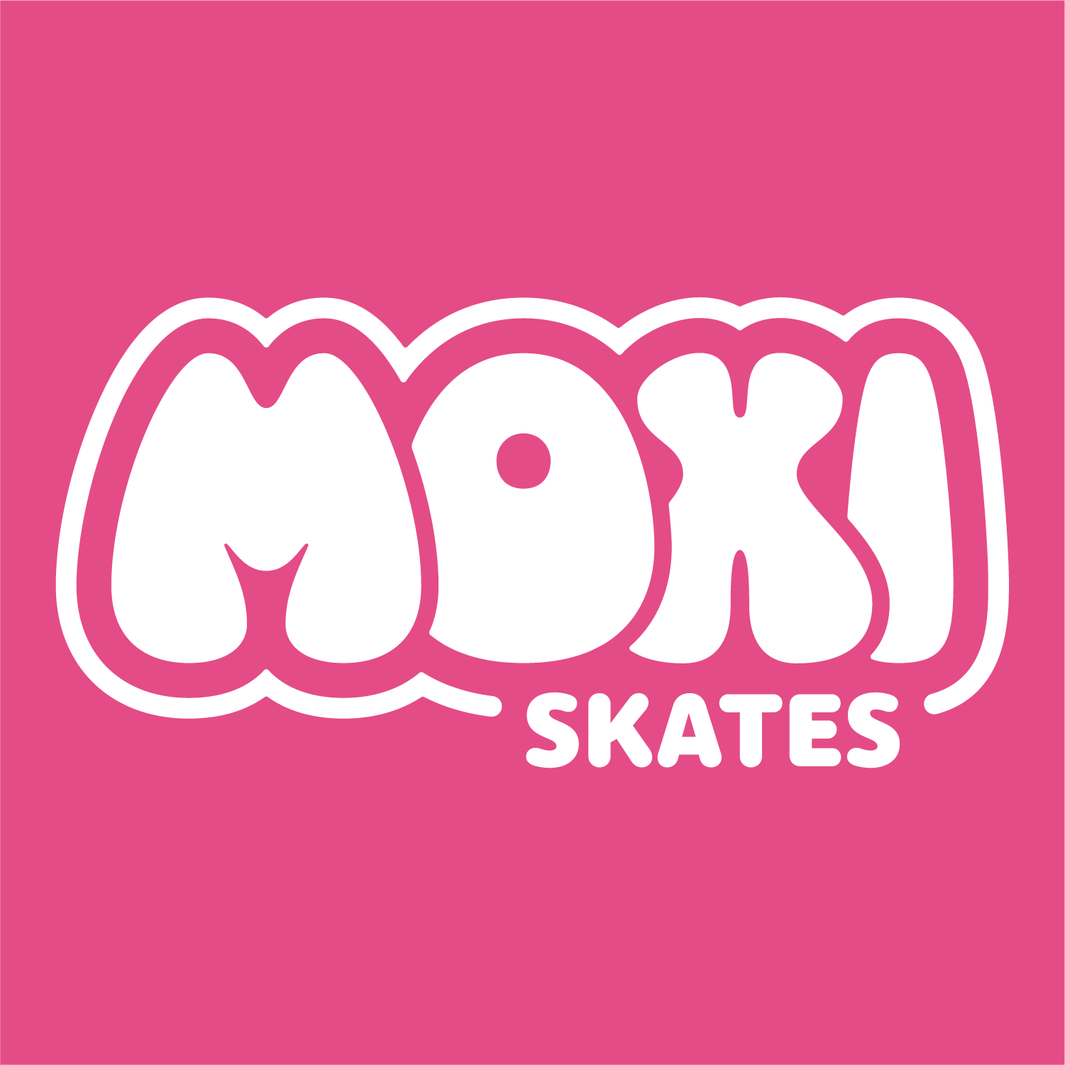
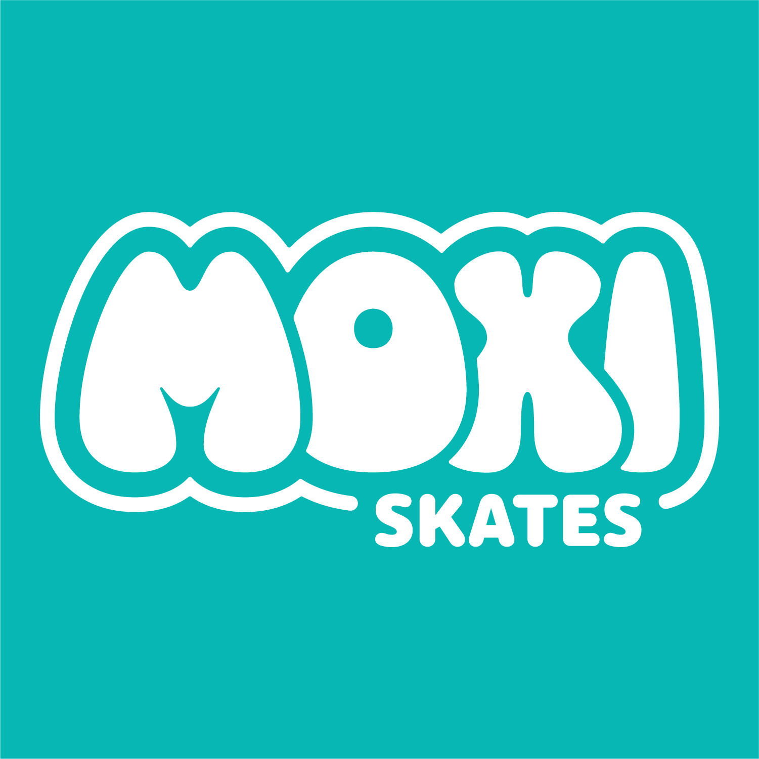
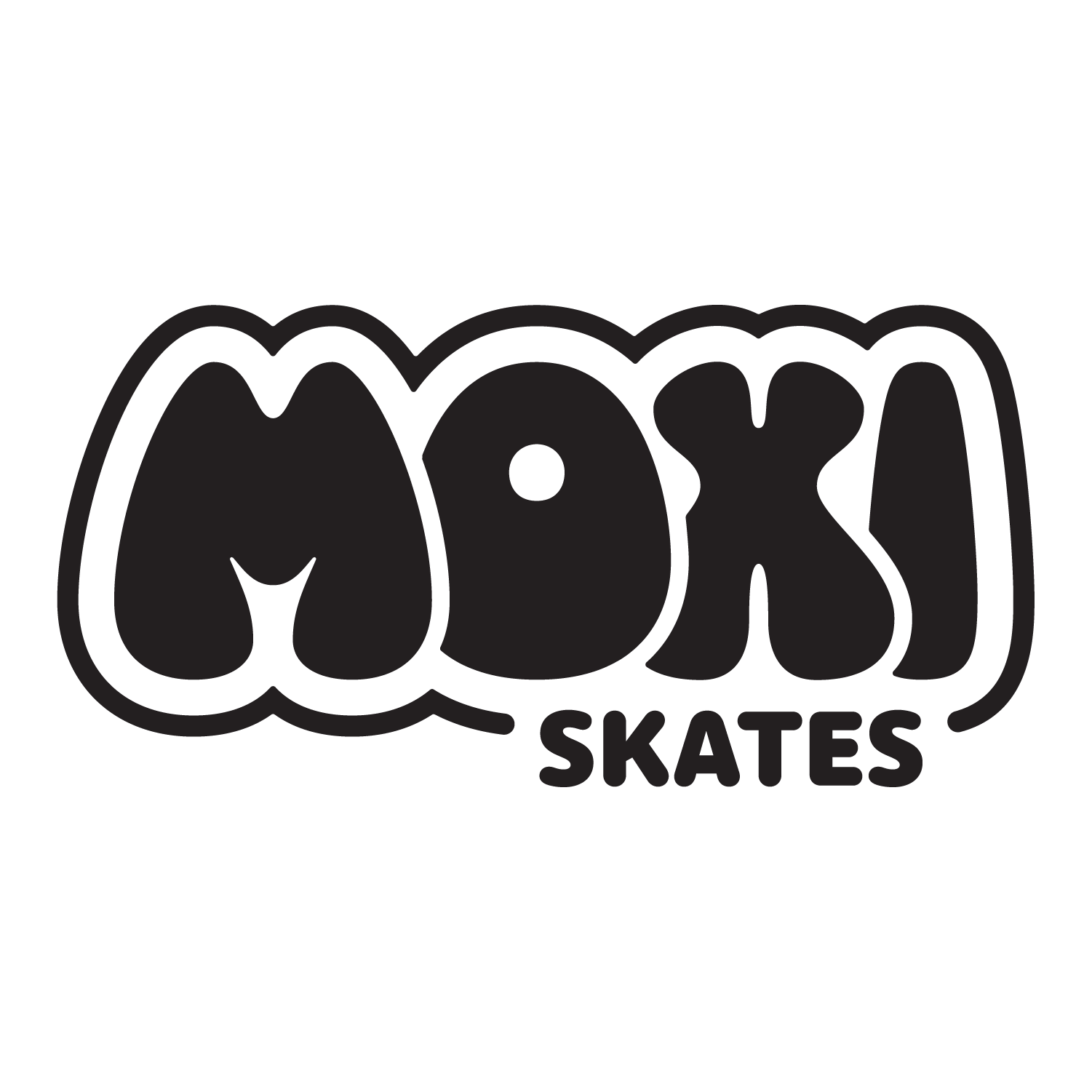
Based on the results of my survey, I decided to focus on improving the logo to make it more readable, professional, and clean, while keeping its playful and retro qualities.
Created for Graphic Design Studio ___ using Adobe Illustrator, Photoshop, and InDesign
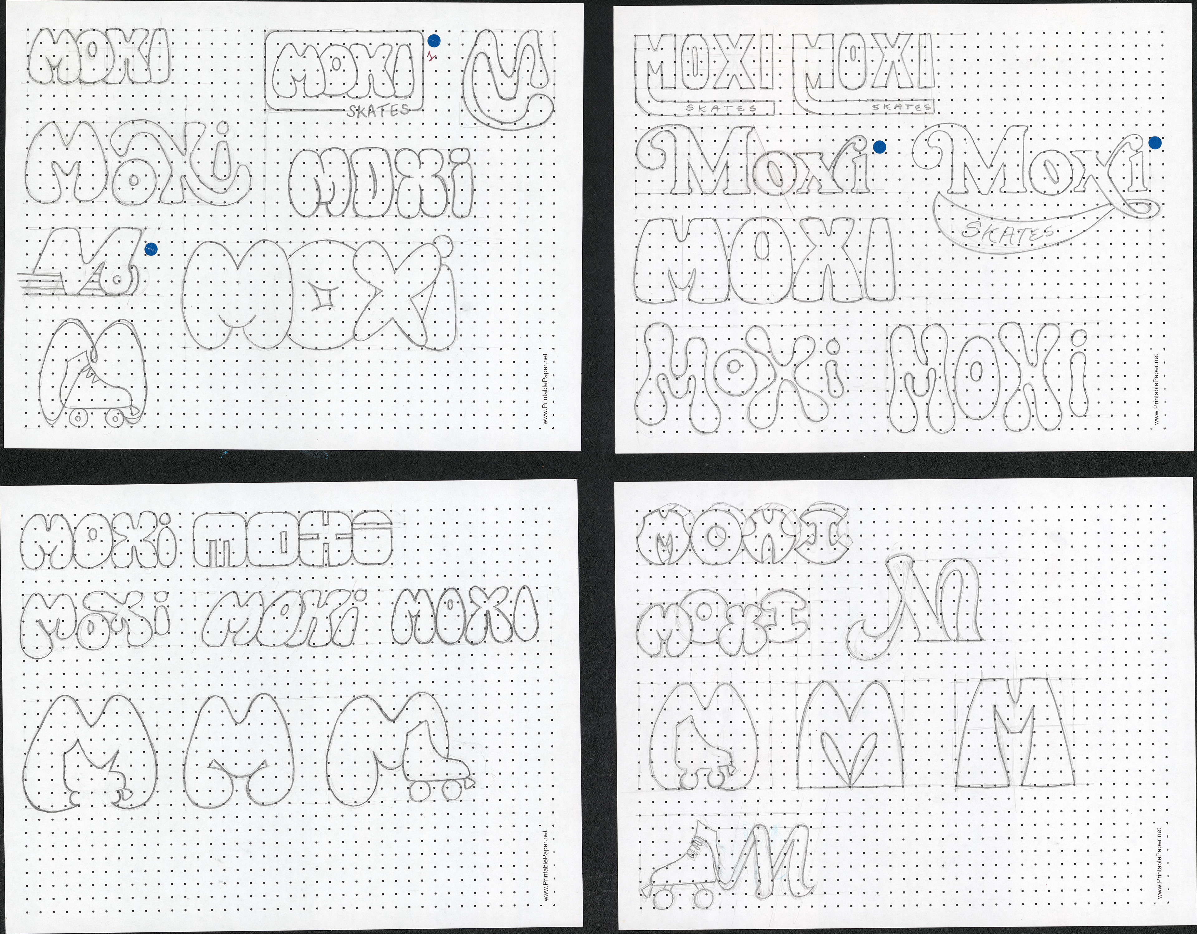
My initial sketches
My sketches were reviewed by my peers and the best options were marked with a blue sticker. I eventually landed on the best option for Moxi and refined it to get the logos below.


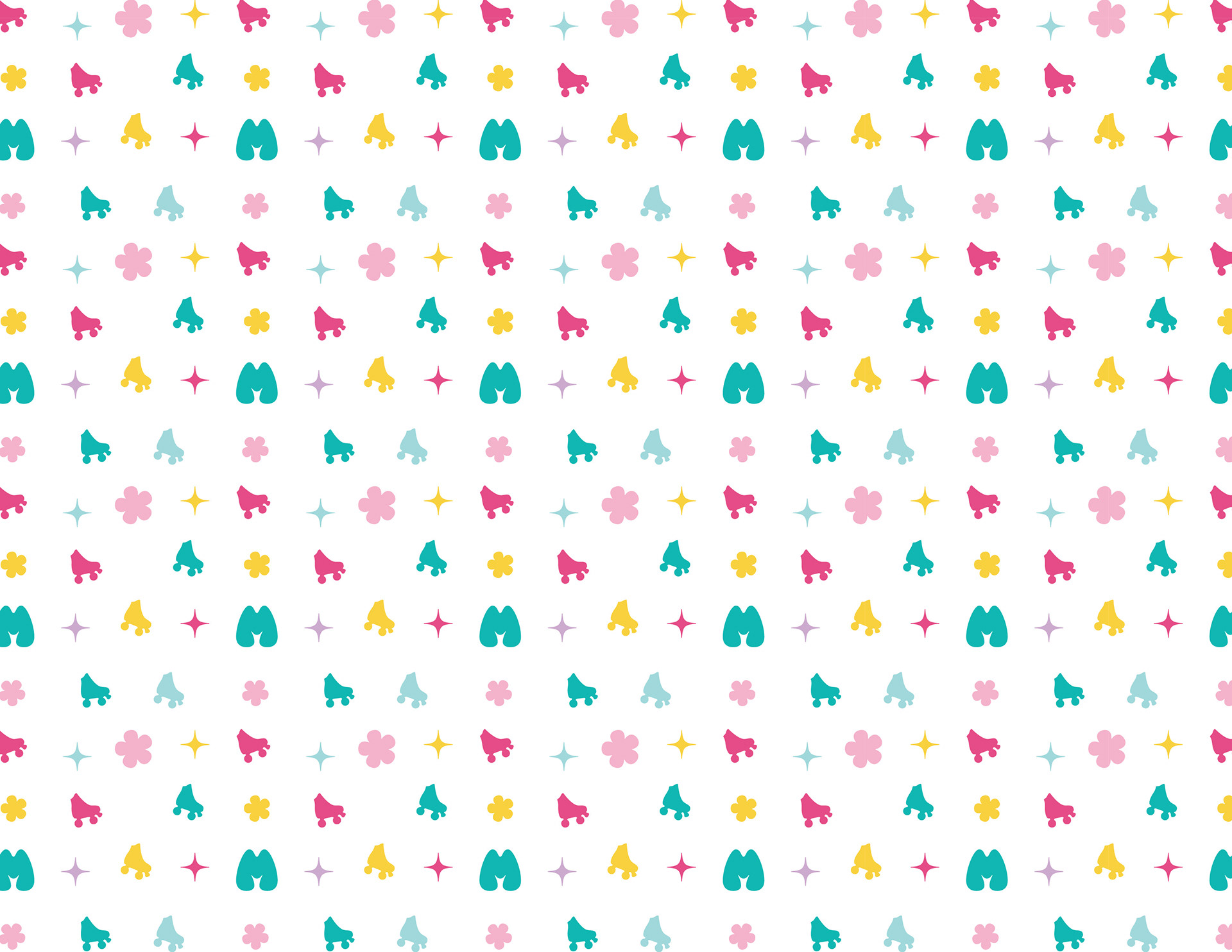
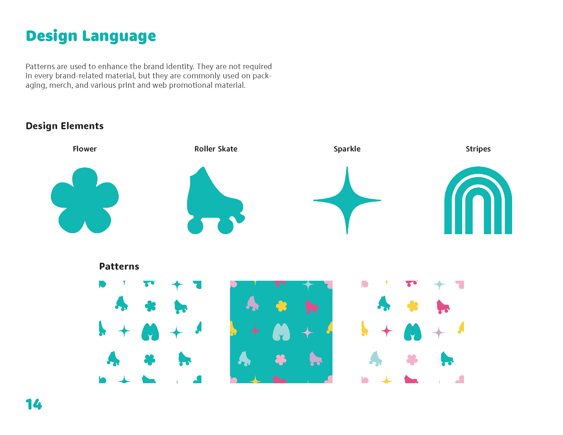
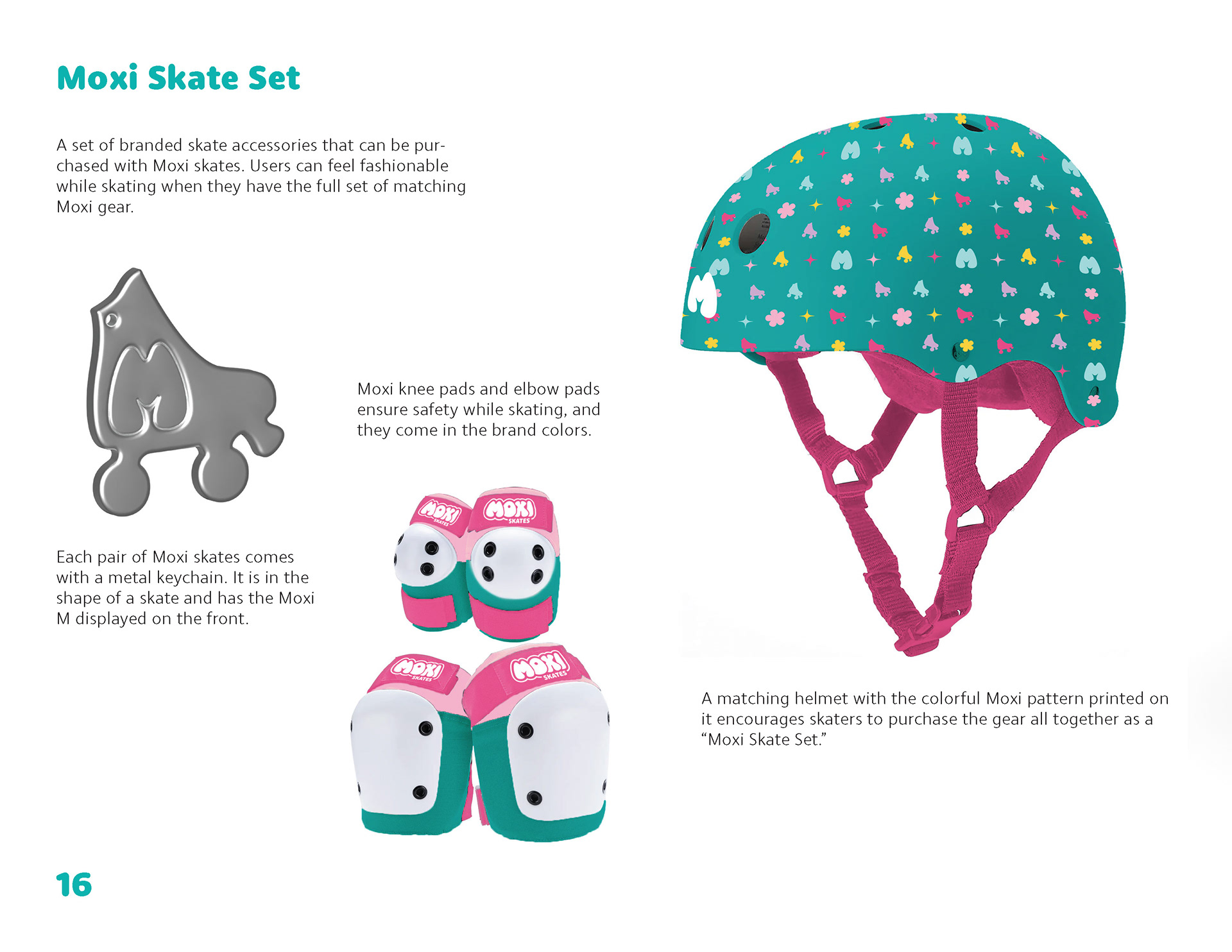
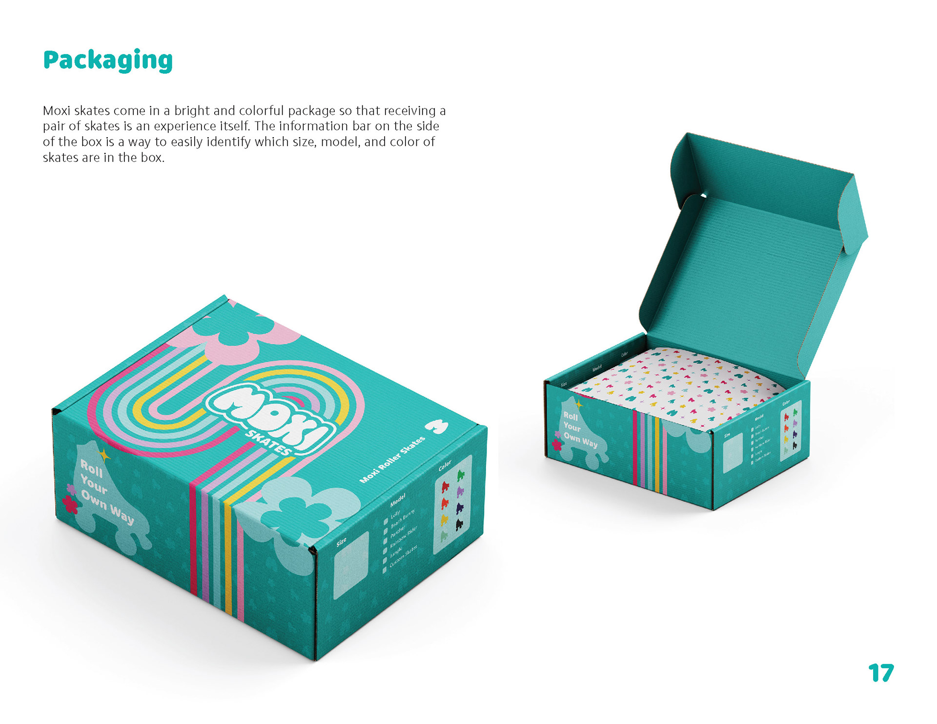
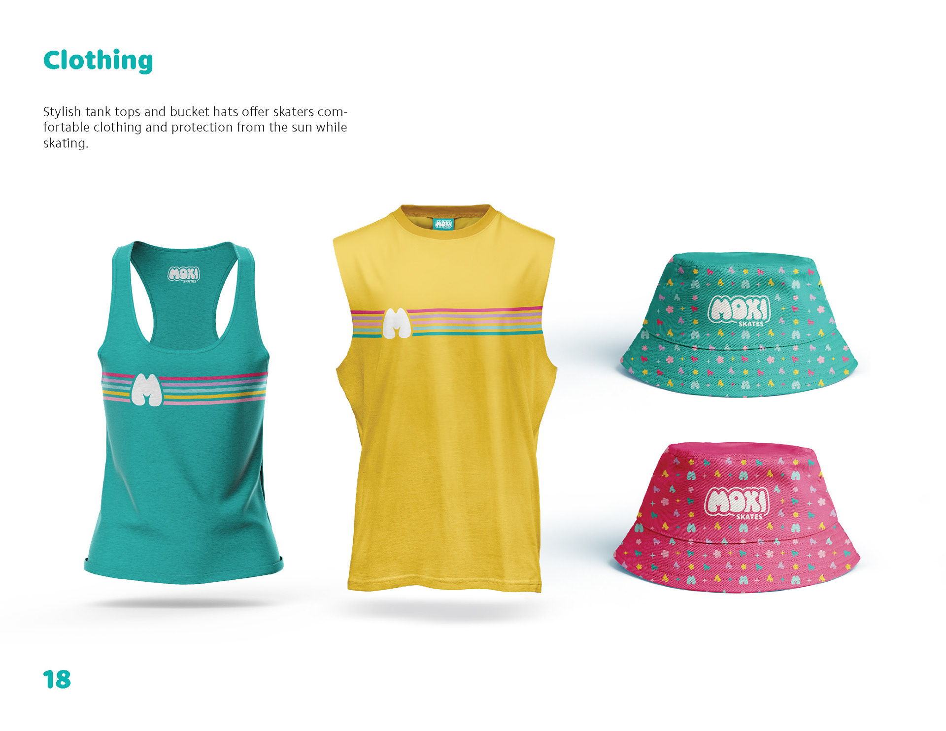
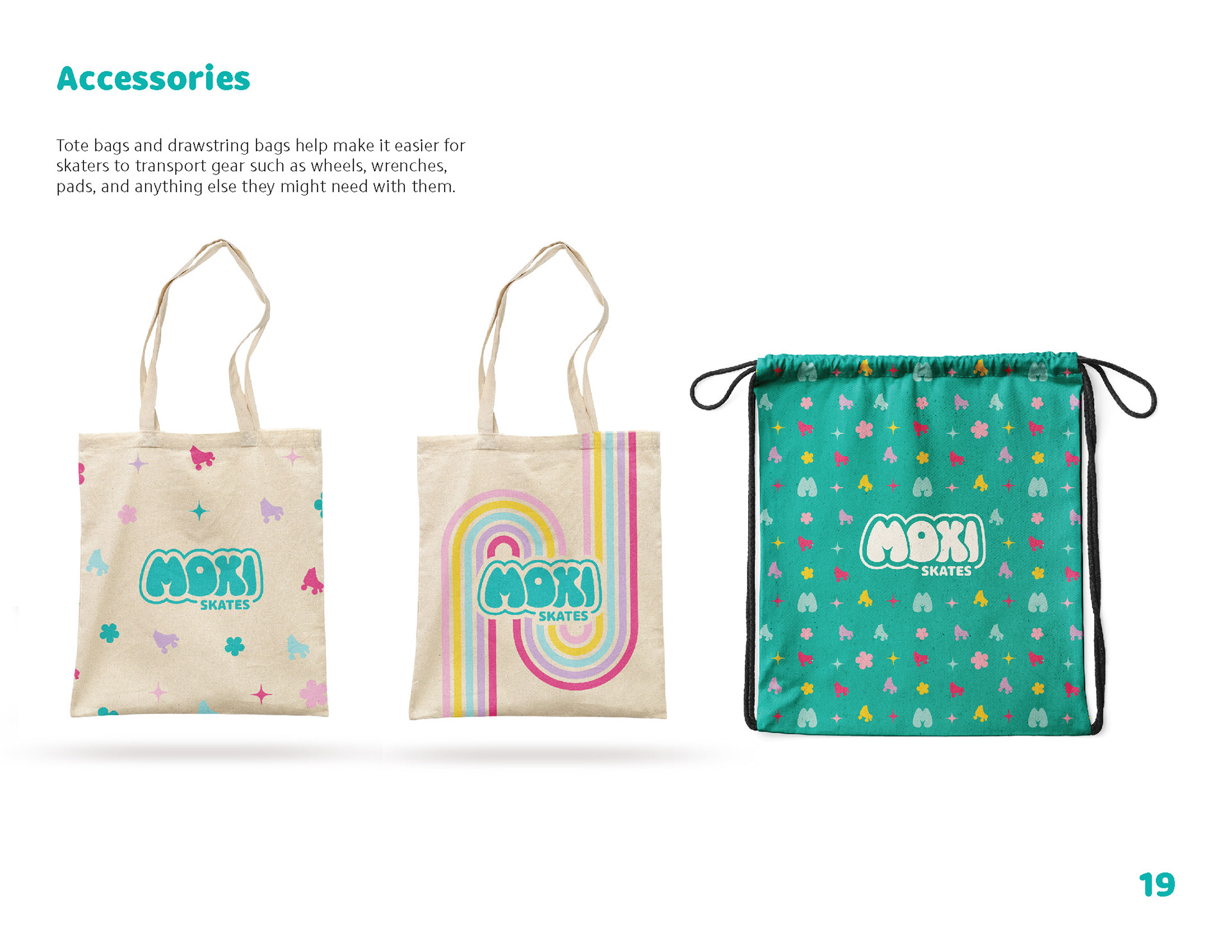
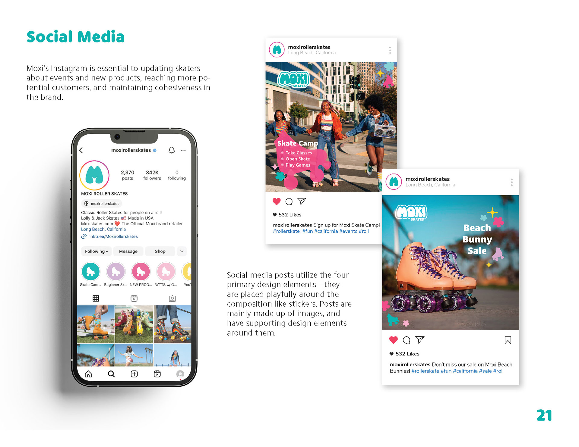
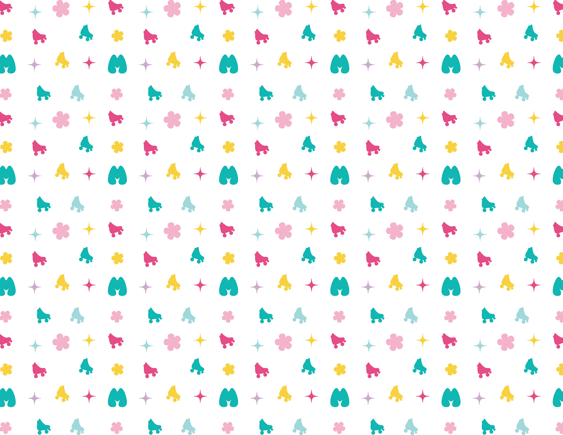
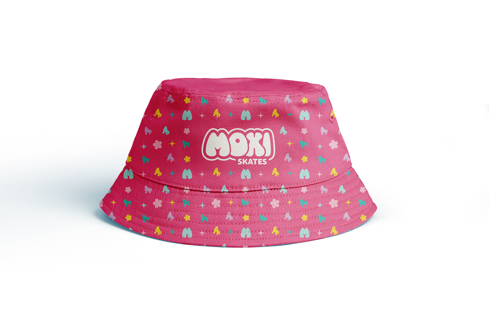
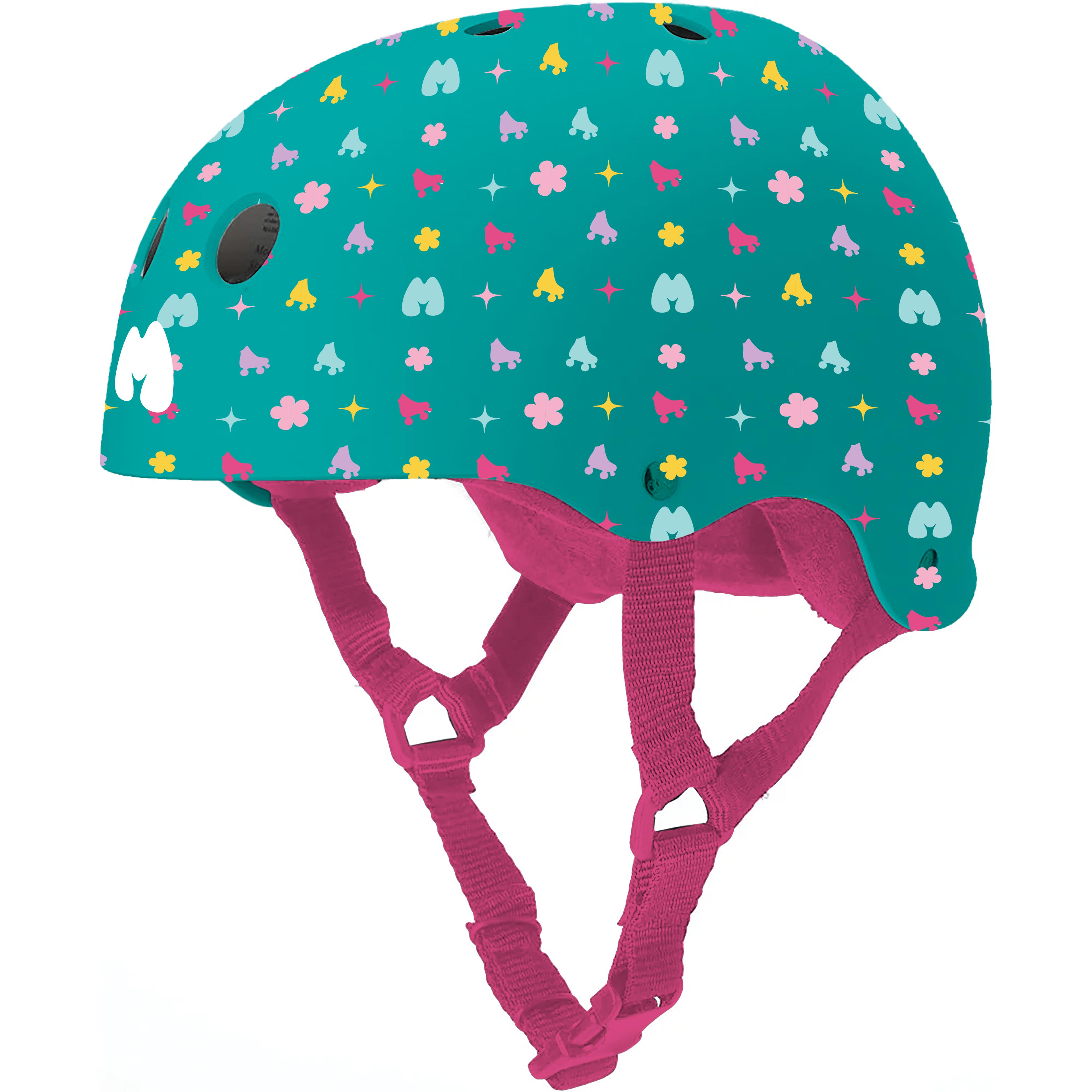
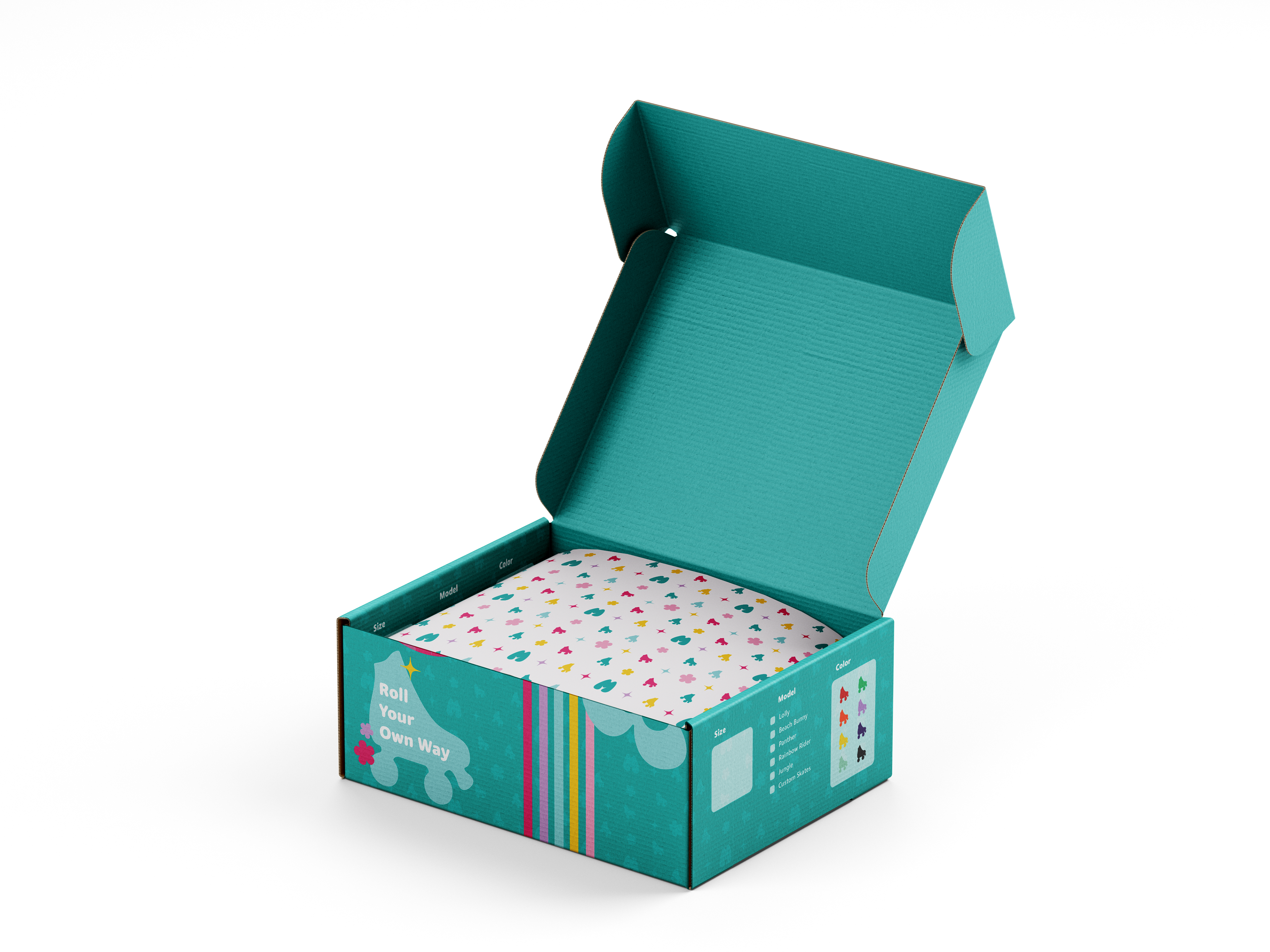
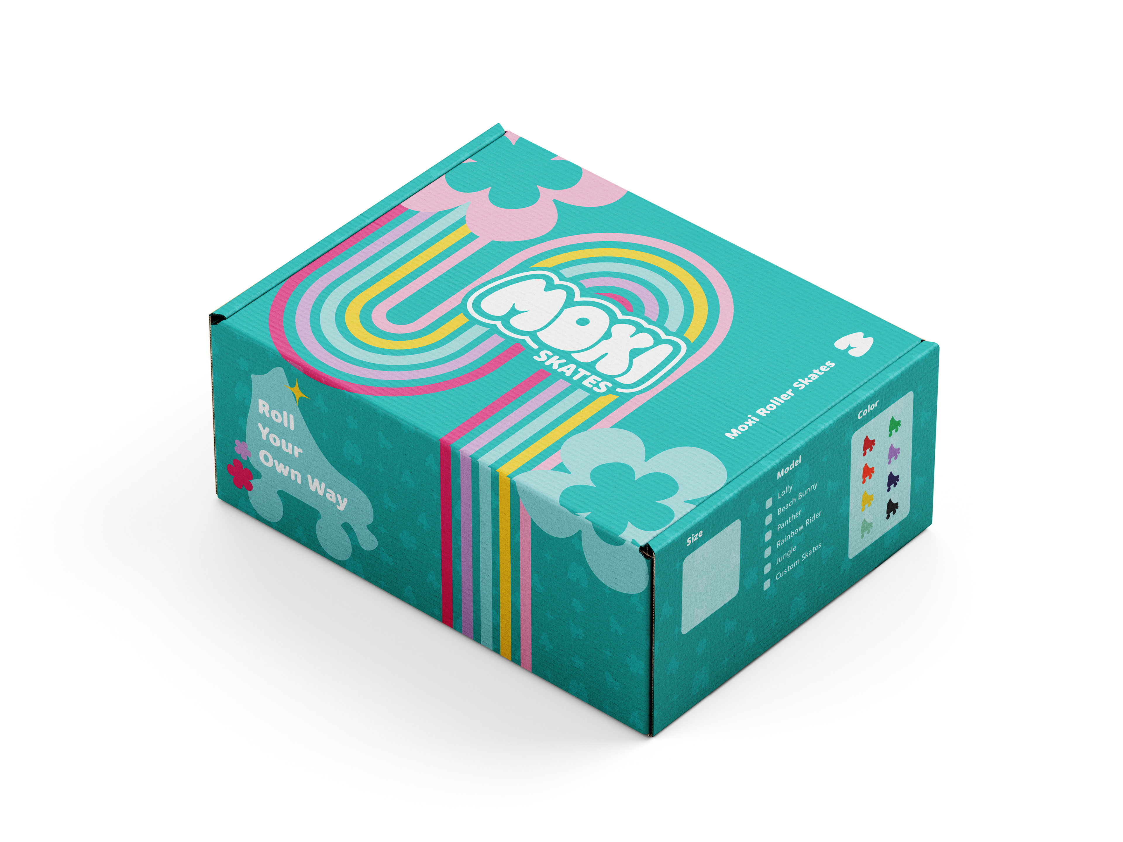
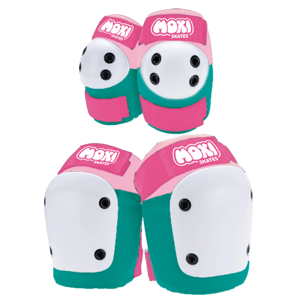
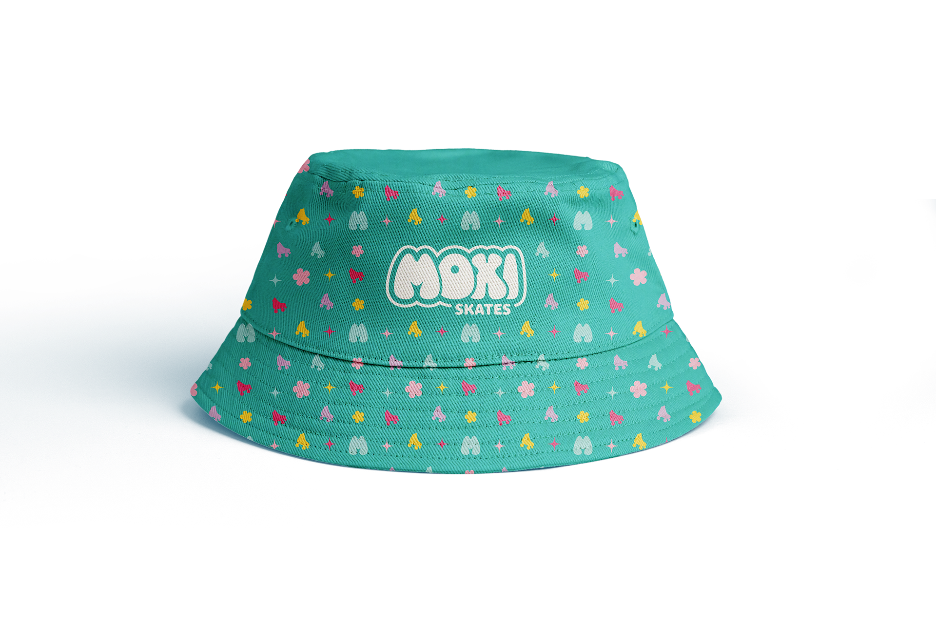
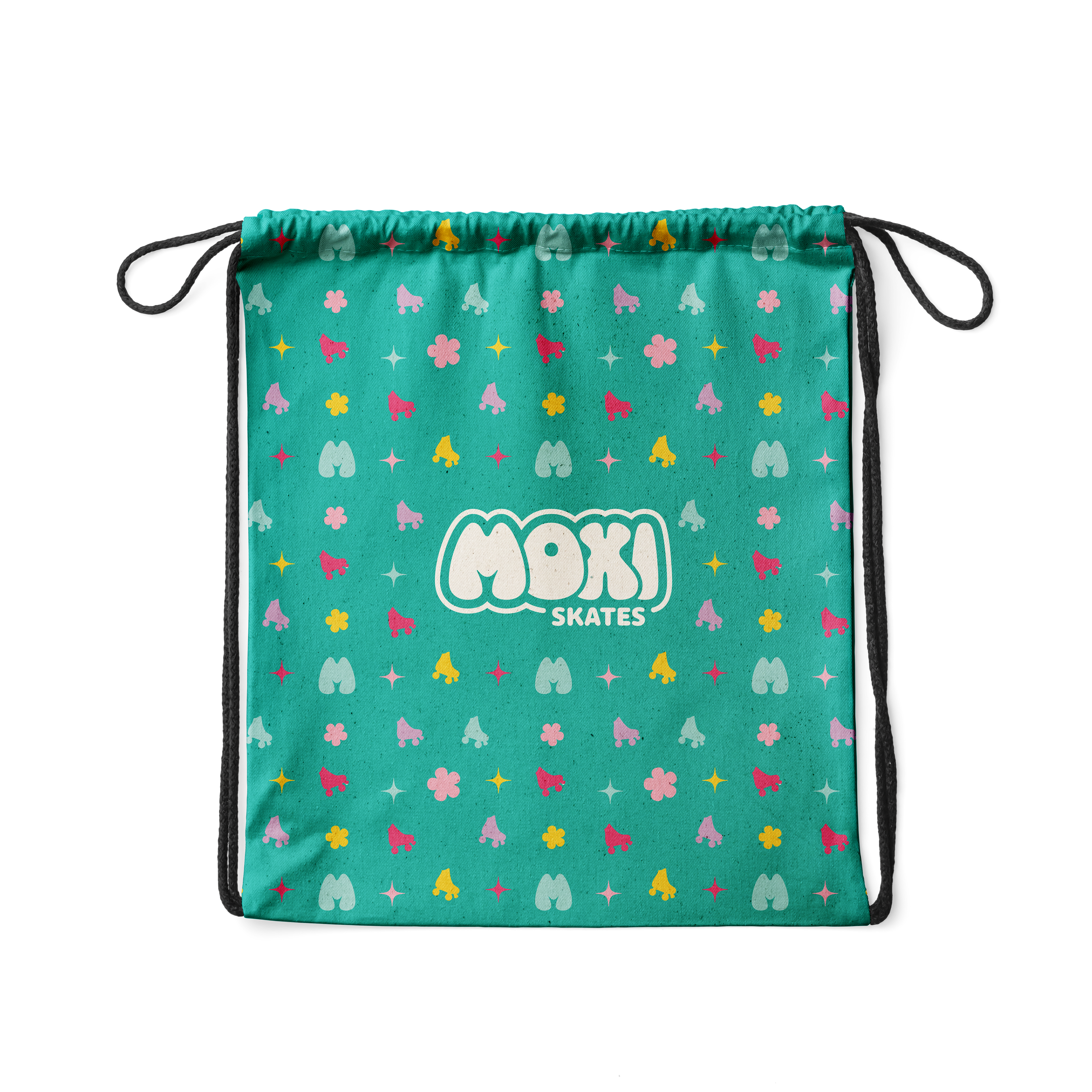
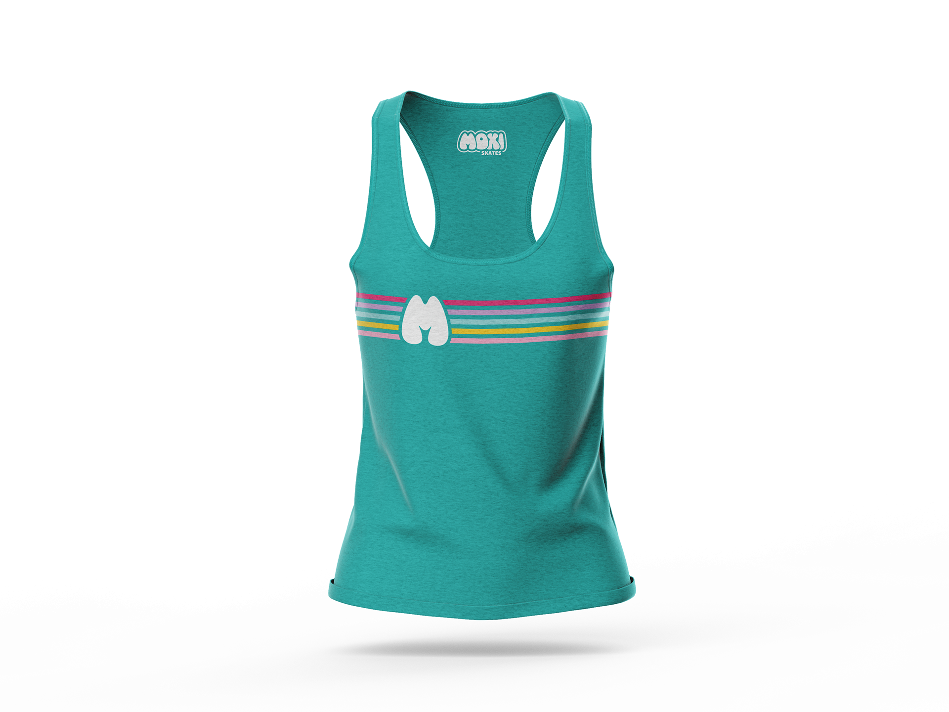
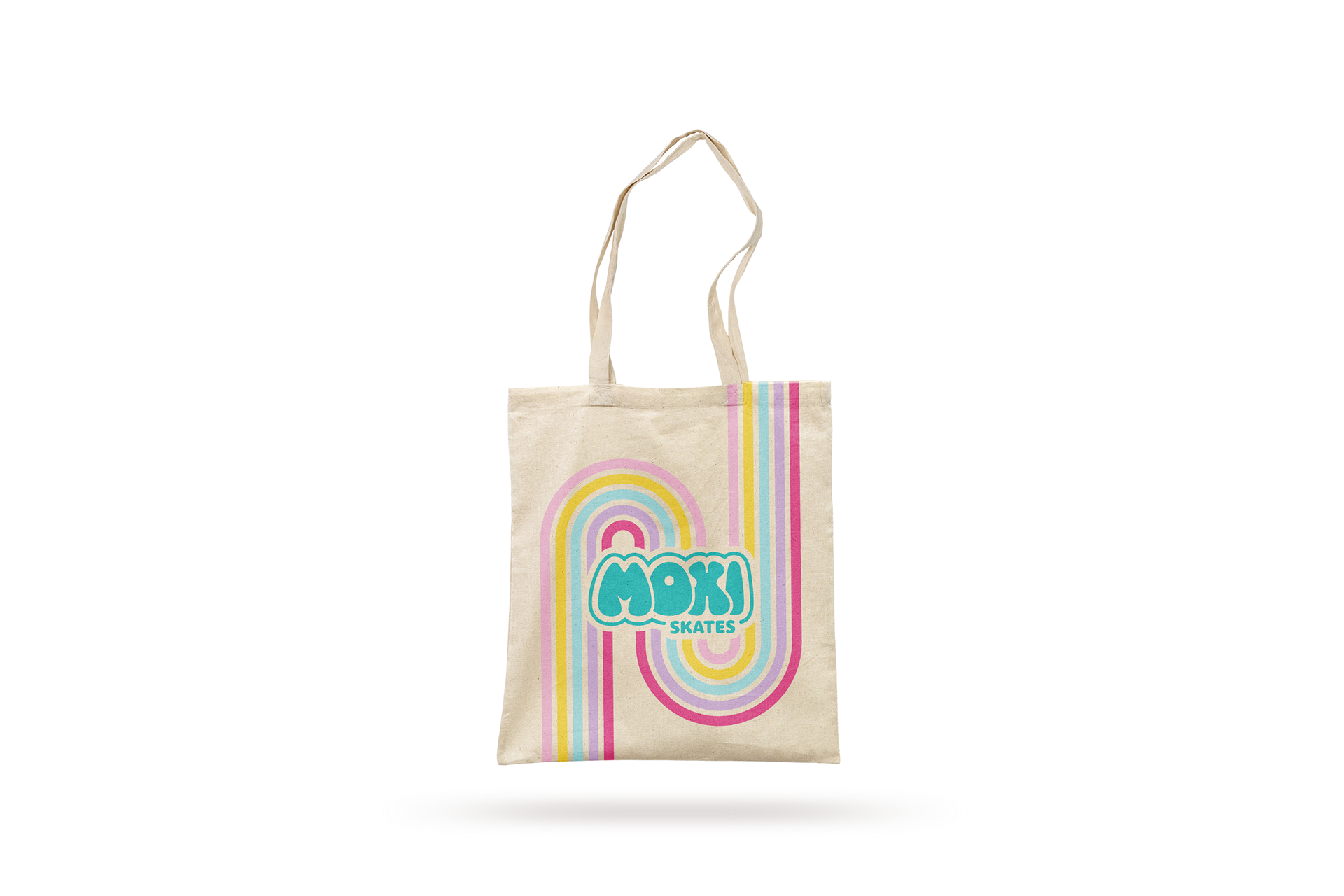
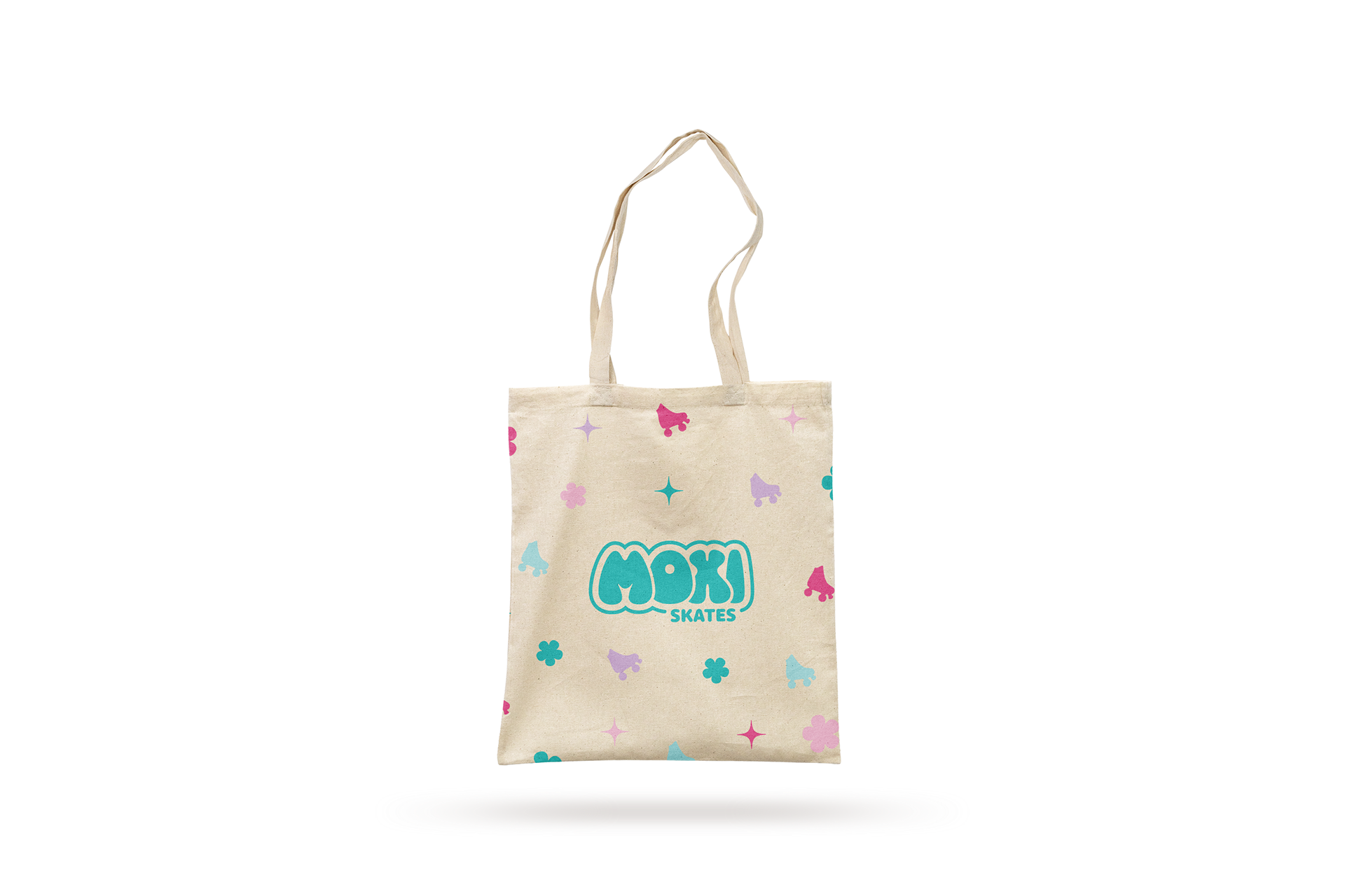
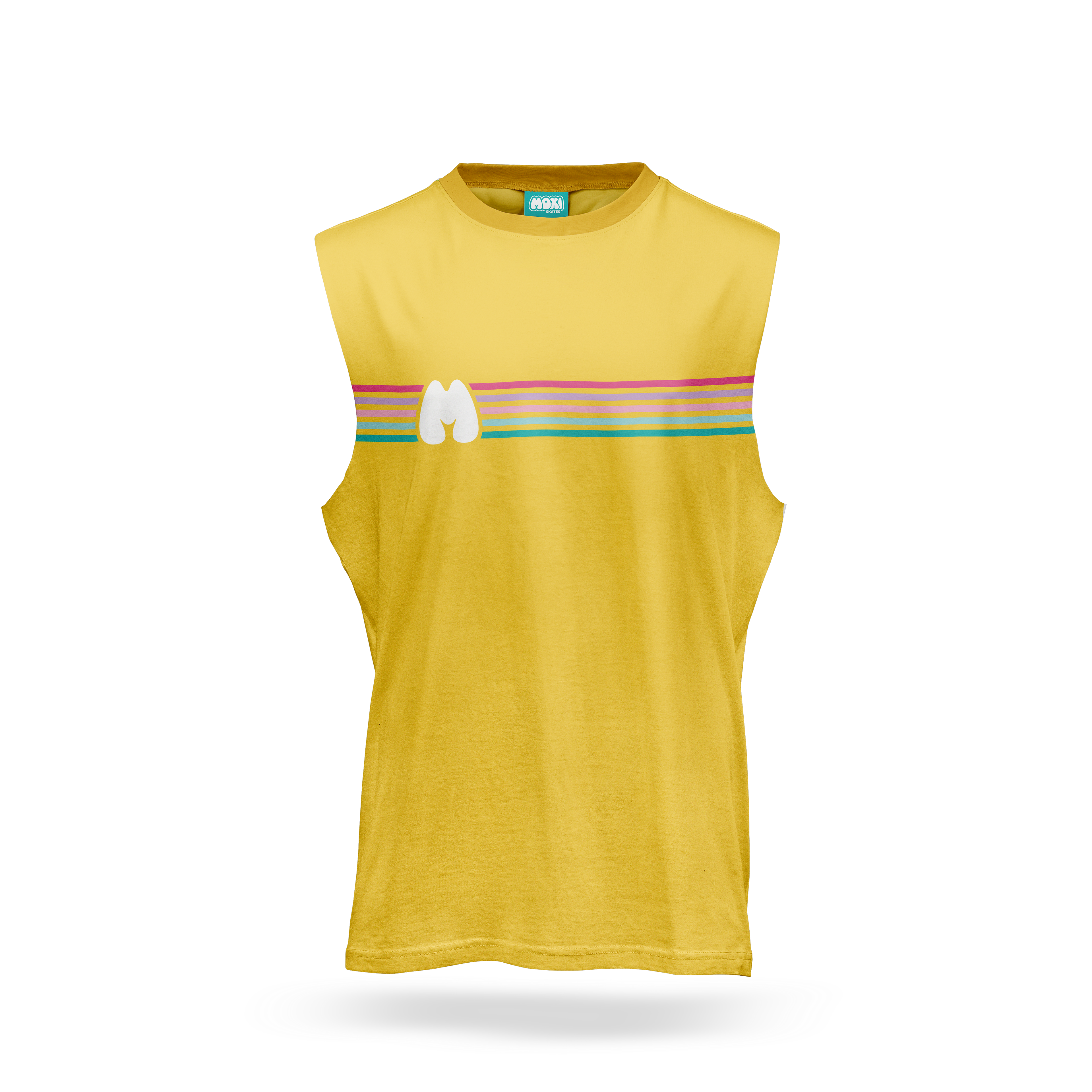
I then started working on mockups for the new product designs I wanted to do. I created a pattern including four elements: roller skates, sparkles, flowers, and stripes (based on Moxi's current brand identity). I used that pattern to create designs for packaging, clothing, accessories, and skate gear, so that I could create consistency in every aspect of Moxi's branding.
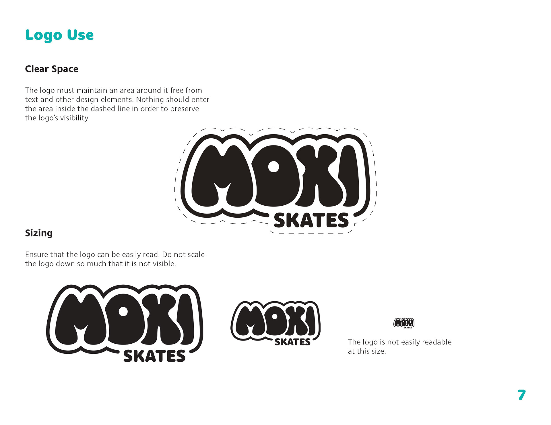
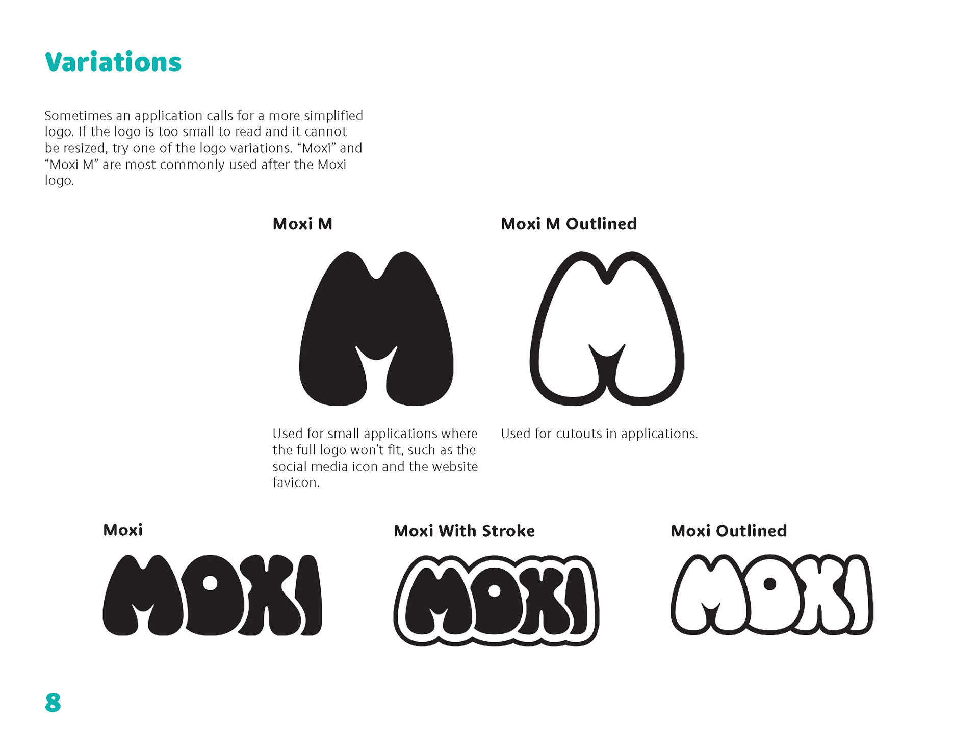
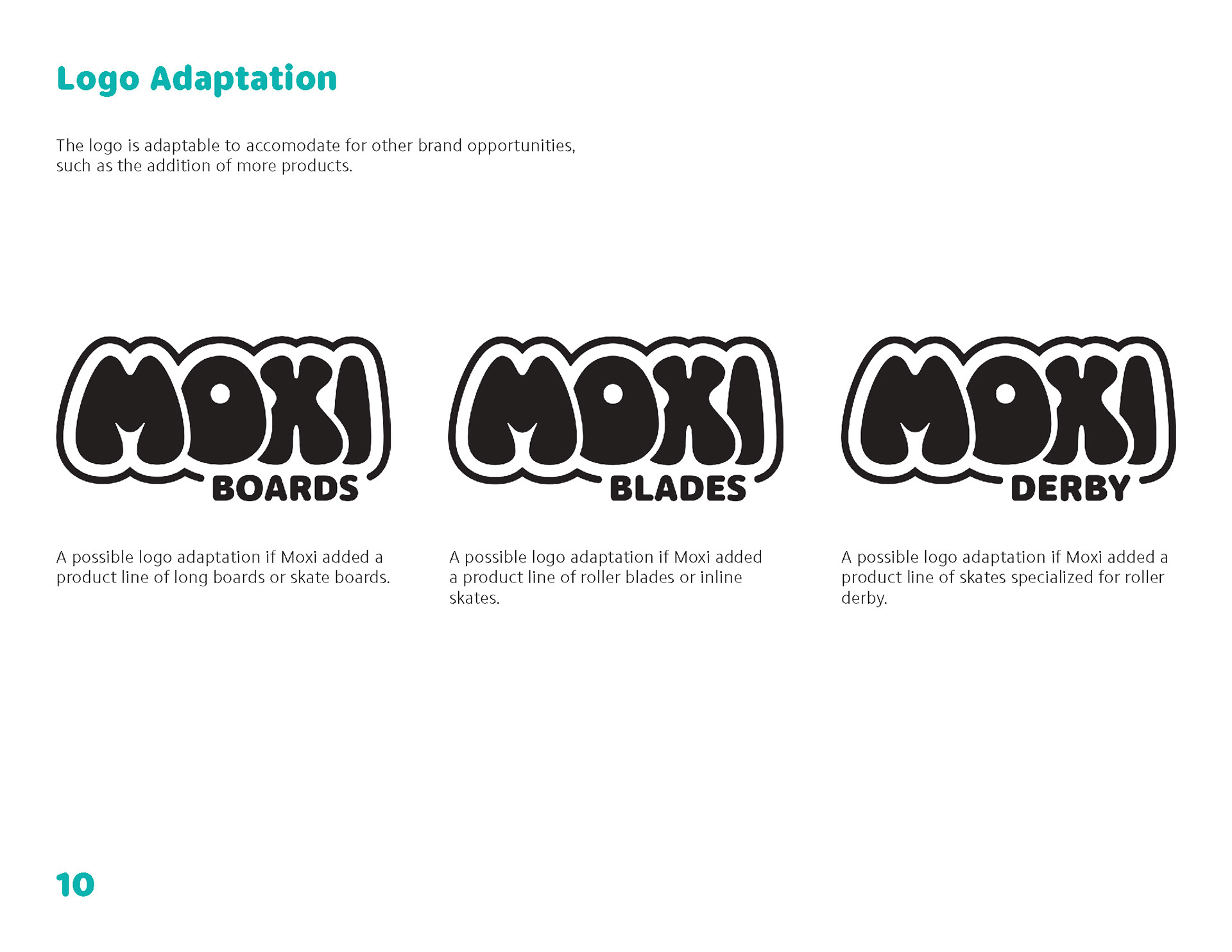
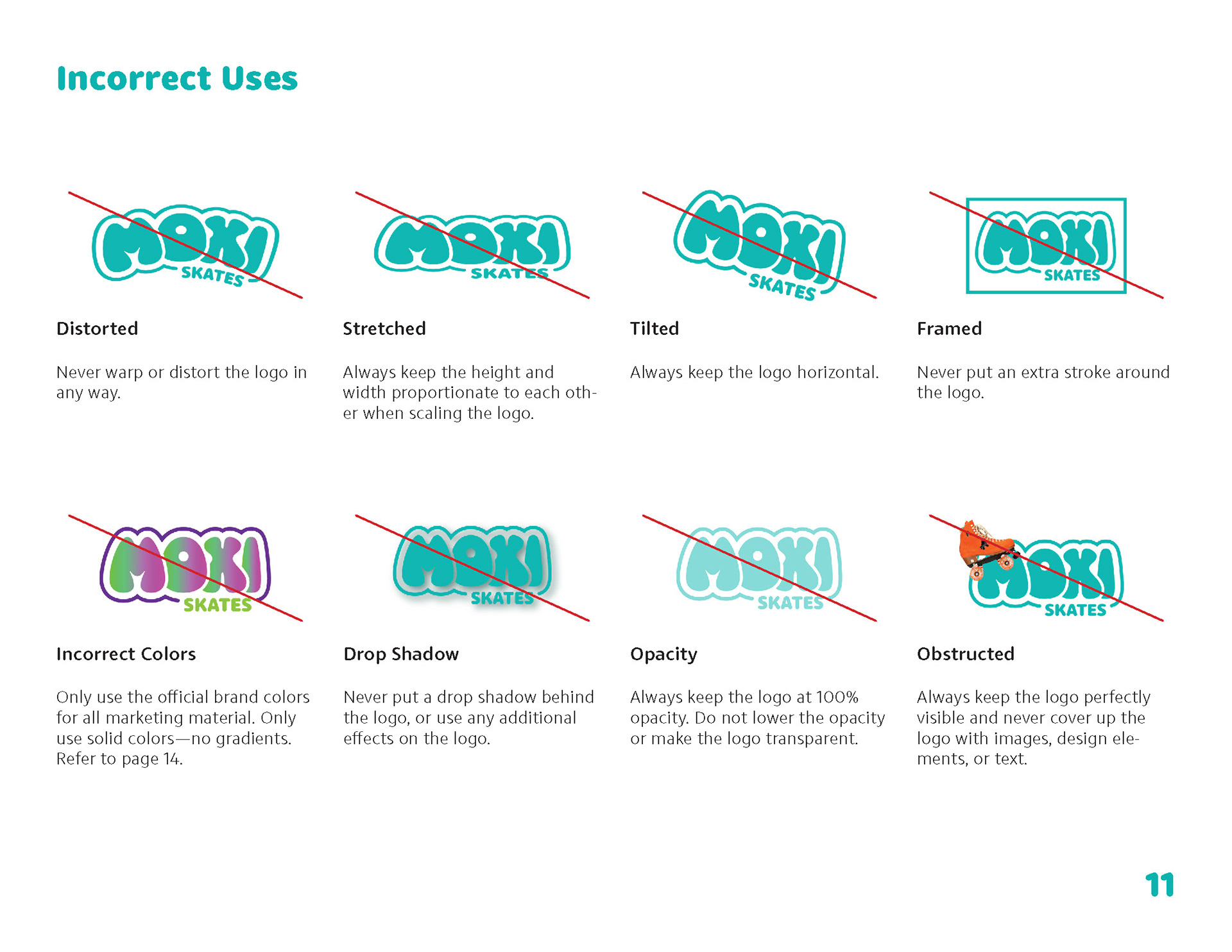
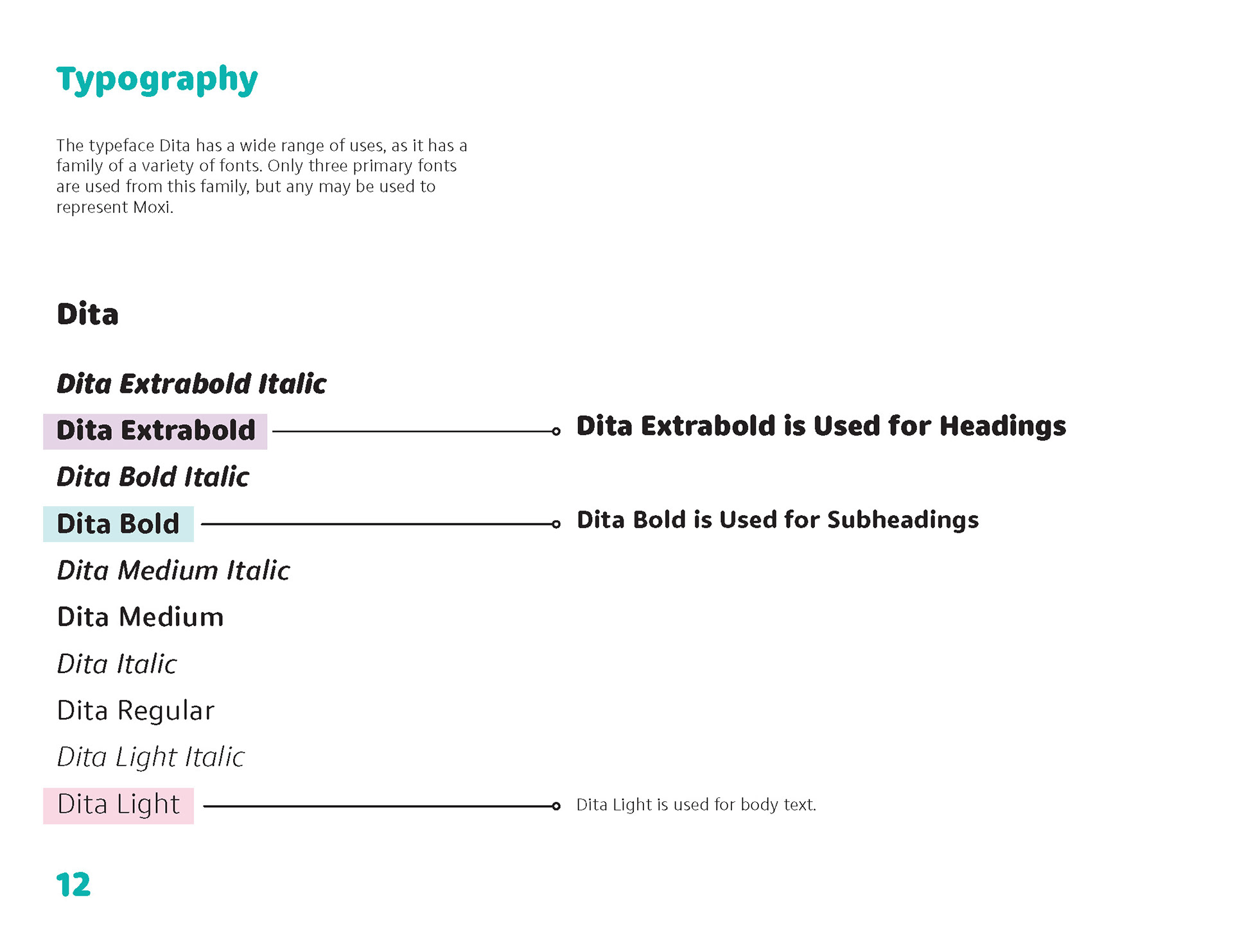
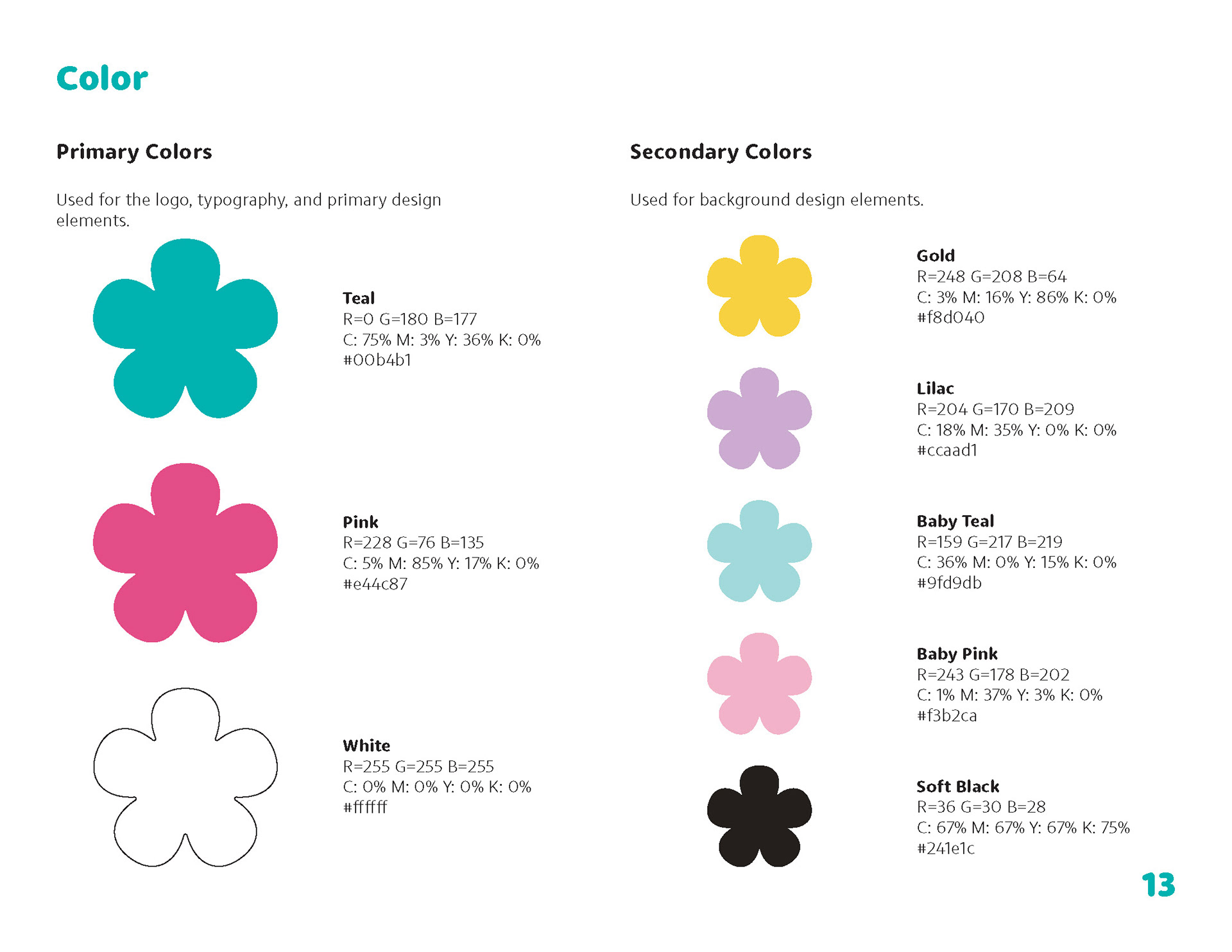
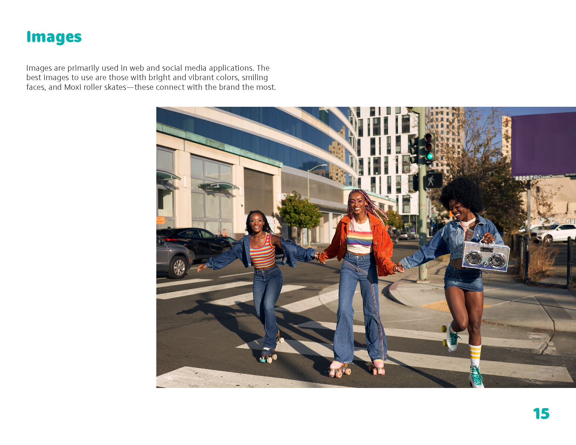
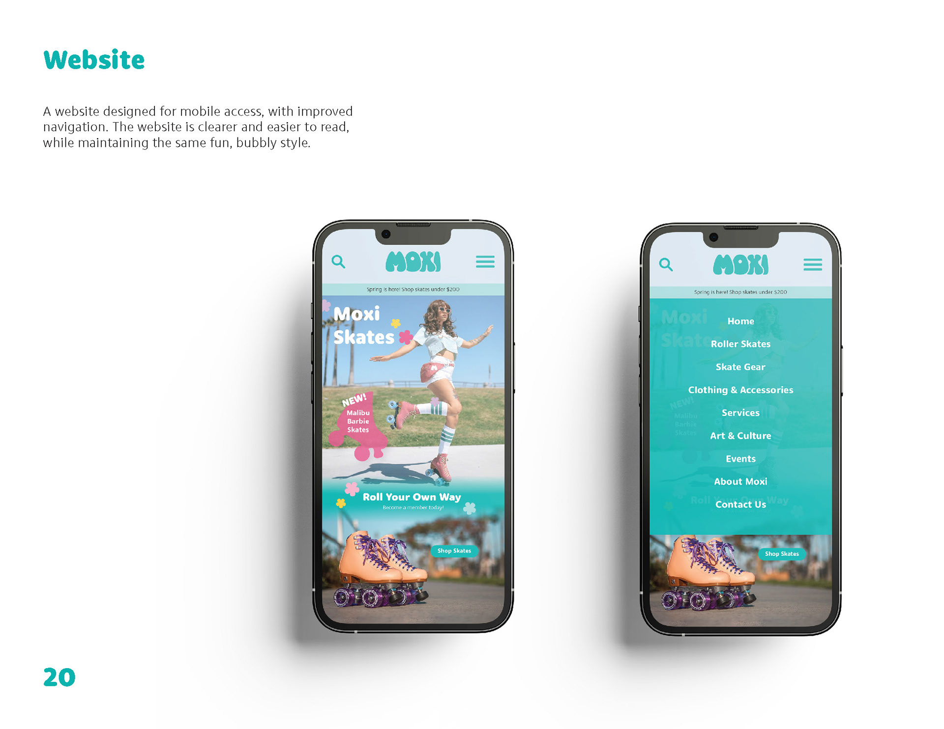
Finally, I created a brand manual to outline the new brand identity I created for Moxi Skates, including color, typography, logo usage, and mockups for website design and social media posts.